Event Experience Podcast Redesign
2021
In 2021 Bizzabo, post-rebranding was looking to get back into the podcast arena. Their industry favored podcast was set to reflect their knowledge share and authority in the industry.
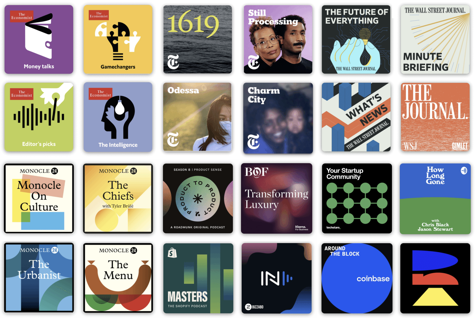
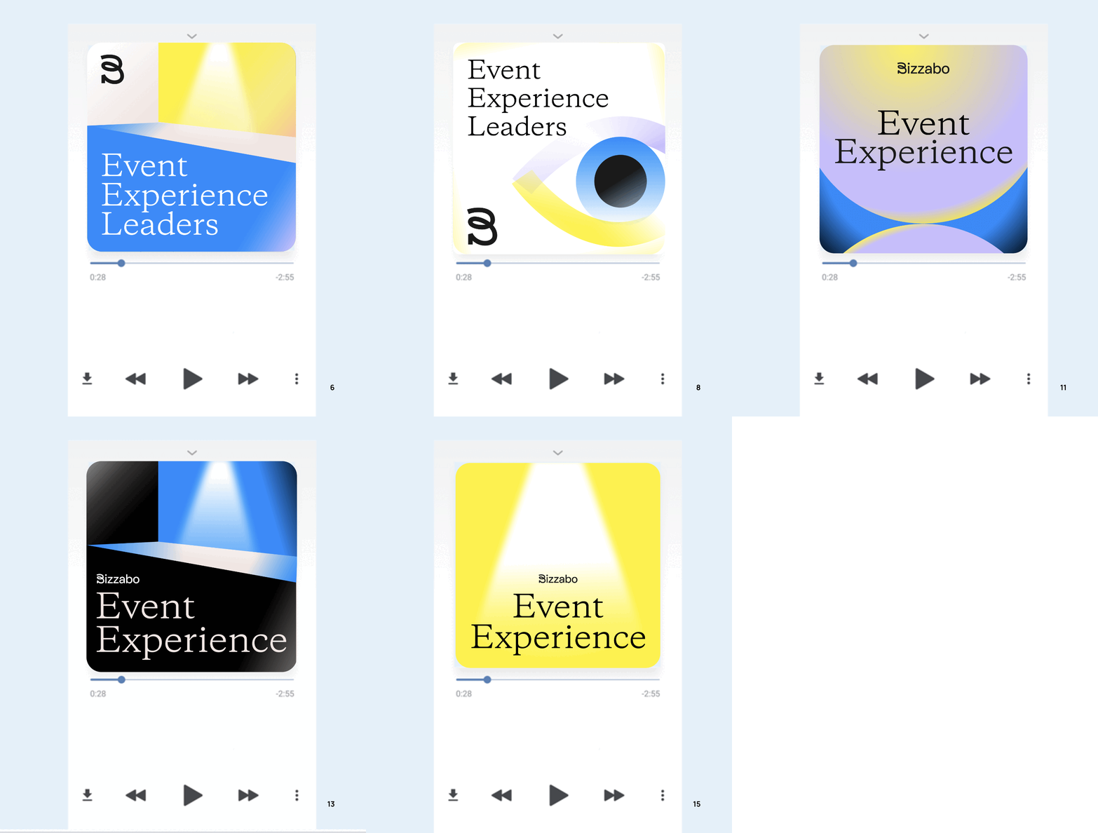
I set out to discover how the rebrand could exist in a tiny 1x1 frame on our phones and desktops and first spent time understanding the podcast landscape. The trends here were the same within the industry; bold contrasting colors, the use of gradients and opacity to create dynamism in a small shape, strong and architectural use of text, and so on.
The task was to create the campaign swiftly, developing it not only as a brand line but also as a distinctive section of the overall brand.
When I joined, the brand design was just 4 months old. Leading this exploration was a fantastic opportunity to push the boundaries of color and illustration that had already been established. I noticed the limited use of gradients in the brand's illustrations and the incorporation of abstraction to communicate complex business concepts.

Next Steps.
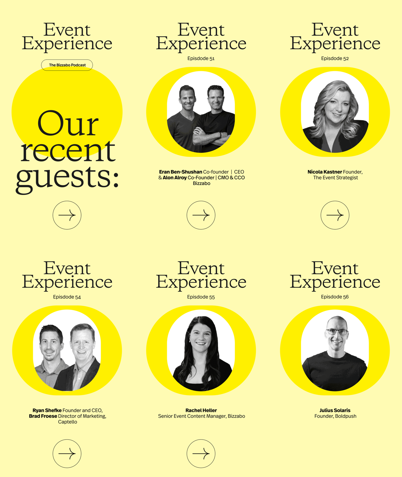
The podcast is currently in its third season since the redesign. The podcast brand wrapper has undergone slight adaptations to incorporate changes in closed captioning but has remained consistent since the 2021 redesign. This has served as a model for brand-extension projects within the team.


